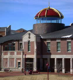
The architect meant well. He was seeking to combine classical elements with a modern twist. I would suggest that he failed. The gold-and-maroon dome does not sync well with the rest of the building. And where in classic architecture do you see a 360-degree clear glass balcony?
It is very possible to combine classic design with modern style – but that is a difficult task. All the more pity when millions of dollars have been spent in the exercise.
The beauty of graphic design is that the stakes are usually much lower. One exception would be when a corporation rolls out a new logo. If they failed, it’s hard to roll back in the red carpet.

It isn't the dome itself that I mind, it's the glass that makes it appear to float in the air. As in the design world, you can't always blame the designer – sometimes it's the client that insists on something goofy.
VERY good point, Deb. The designer may have had a fantastic design, and the client had a different thing in mind.