Most of my readers know that I cling to the credo, “short is sweet.” This relates to “less is more” concept.
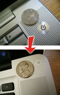
Most of the time, computers get better. Apple updated their MacBook Pro line in October 2008. This was their first significant visual redesign since the first PowerBook G4, which came out in January 2001! And it was better in almost every way. They made some of the design elements smaller. You can see the power button and speaker holes shrunk by large percentages. I think it was a positive move.
Takeaway: When you write for your blog, magazine, newspaper, or whatever – see how few words you can use to make your point. Your readers will silently thank you.
