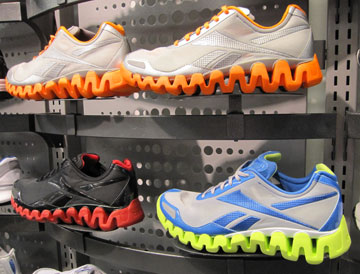
 Reebok recently released the Zigtech shoe line. I think they’re really fun. Heather doesn’t like them. I don’t need a new pair of shoes, so the decision to not buy a pair was easy.
Which one do you like best? Or are you with Heather on this one?

Paul Merrill
 Reebok recently released the Zigtech shoe line. I think they’re really fun. Heather doesn’t like them. I don’t need a new pair of shoes, so the decision to not buy a pair was easy.
Which one do you like best? Or are you with Heather on this one?
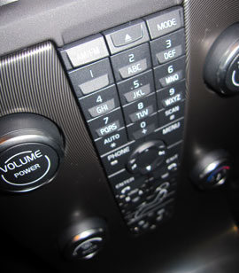 This “center stack” of dashboard controls looks pretty cool. It’s from a Volvo. (I can tell by the typeface.)
Design mistake? When you’re driving down the road at 75 miles an hour (120 kph), the last thing you want to do is take your eyes off the road long enough to figure out which button you need to push to make the hot air go to your feet rather than at your face.
Takeaway? When you’re designing that thing – or planning that speech – go for what will serve the user best rather than what causes the biggest wow. (But be sure to leave enough wow in to make it exciting!)
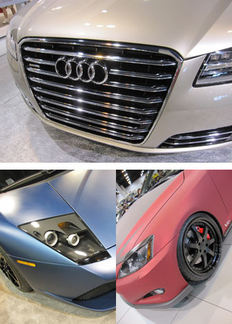 Top: The forth-coming Audi A8. Notice the resemblance to the front of a train. That design trend started in Europe because their pedestrian safety laws forced vehicle fronts to be more horizontal and less pointy.
Bottom: Matte-finish paint seemed to be popping up in a few places among the cars we saw at the Denver Auto Show. My son Jay and I both liked the visual effect. (Left is a Lamborghini and right is a Lexus.)
 When I saw this logo, the first thing I thought of was “biohazard”. I don’t have any negative feelings towards Disney Stores, but their logo looked a lot like the biohazard symbol.
Yes, I know there is the figure-ground thing happening (for those of you who might have taken an art class). But the red toxic waste aspect to the symbol also conspired against my perceptions.
It boils down to usability. They designers (or the client) should have tested this application of the logo with a few more people before it saw the light of day. A simple change to light green would have done the trick.
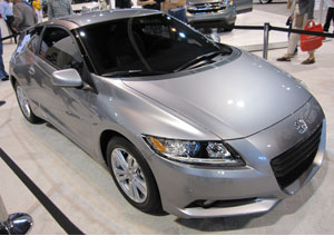
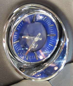 Last weekend, my son Jay, his friend Taylor and I went to the Denver Auto Show. It was great!
A highlight was seeing the Honda CR-Z in real life. It’s a small 2-seater that’s the grandchild of my favorite car that I ever owned, a Honda CRX. They both have a great combination of fun driving and excellent fuel economy. The CR-Z updates the formula by adding hybrid drive. (And of course the cost will be about four times what the CRX was, not adjusted for inflation.)
The lowlight was the new Jaguar XJ. For more than $72,000, it did not deliver anything close to my expectations. Admittedly, I did not get to drive one. But I sat inside and played with all the knobs and controls. I was completely unimpressed at how one of the rear passenger lighted mirrors did not come on like it was supposed to. And from this pic, you can tell that they stylist chose a clock that would have been more at home inside a 1980 Cadillac. It also looked like I could have bought one off a vendor in the streets of Nairobi for about $20.
My only regret about the show was that John could not join us. (He’s in Germany.)
 Have you ever looked closely at a mail truck? (If you’re in the UK, substitute a milk float.)
It’s a crude design… The bolts are exposed. The gas cap is visible. The corners are square. The windshield is nearly upright.
But so what? Most of the time, it travels no more than 30 mph. Aerodynamics – no need. Style – why should they bother? Speed – next to none. Cushy ride – well, the postal worker might appreciate better.
The cheapest car you can buy has a much smoother design. Its interior is way more refined. But its intended function is different. And car manufacturers have hugely more competition for than mail truck creators.
Takeaway: Don’t put too much effort into something that doesn’t need it.
 As most of you know, I love noticing details.
Occasionally that pays off.
Apple’s Keynote (a wonderful alternative to Powerpoint) is demonstrated by Apple with these lovely examples. Problem? Neither of these photos is anything like Denver at all. Top? English countryside. Bottom? Deep south, USA.
No awards this time. Oh well. At least now you know that Apple’s Keynote project manager has no geographic sense. Maybe they work him or her so hard that they never get to travel. Time for a vacation, I’d say!
Since it’s April Fool’s Day, if this were a joke, I’d tell you. But it’s such a minor thing that it would have made a very poor joke.
Happy April Fool’s Day, whether you live in Deep-South-Denver or England-Denver.
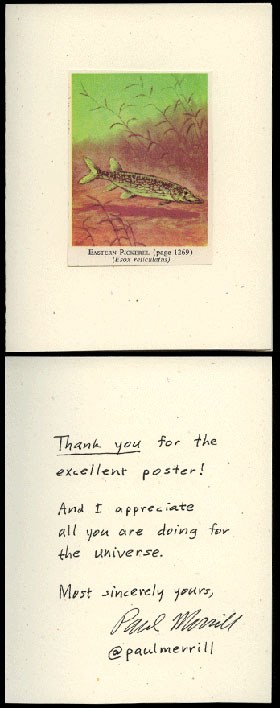
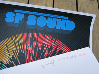 Volume Inc. has a unique contest of sorts. If you send them a hand-made thank you card, you may be among the 100 winners to receive a poster.
I couldn’t resist that.
My poster came last week – hand-signed and numbered!
Special thanks to Alan, who told me of the contest.
 This clothes cleaning establishment’s logo was so bad I had to show it to you, my friends.
This is a perfect case of “spend a little money and get a lot”. Hiring a really good designer to do a great logo might be expensive. But there are any number of mediocre designers out there who could do a much better logo for cheap.
Point being? If you have a professional-looking logo, you project an image of quality. A really poor logo like this one? Well, you do dry cleaning. Maybe poor-quality dry cleaning.
Which of these hair salons would you be willing to spend more money at – top (Cuts to Dye For) or bottom (Vida Salon)?
By the way, “of the week” in the title was just an indication that if I was willing to subject myself to regular misery, I could feature a new bad logo every week until I die – and never run out.
