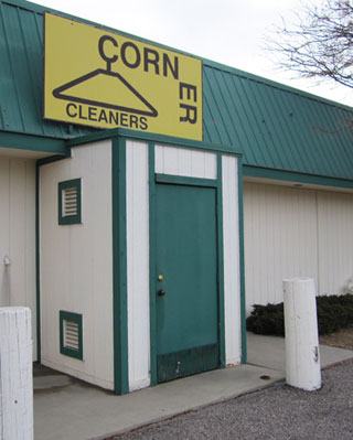
 This clothes cleaning establishment’s logo was so bad I had to show it to you, my friends.
This is a perfect case of “spend a little money and get a lot”. Hiring a really good designer to do a great logo might be expensive. But there are any number of mediocre designers out there who could do a much better logo for cheap.
Point being? If you have a professional-looking logo, you project an image of quality. A really poor logo like this one? Well, you do dry cleaning. Maybe poor-quality dry cleaning.
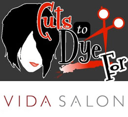
Which of these hair salons would you be willing to spend more money at – top (Cuts to Dye For) or bottom (Vida Salon)?
By the way, “of the week” in the title was just an indication that if I was willing to subject myself to regular misery, I could feature a new bad logo every week until I die – and never run out.


That is a really ugly sign. I don’t much care for the bottom one either, but it’s eye-catching.
Wow… that’s hideous… and not only the logo, either. Place looks like some of these “gentlemen’s” clubs you see along the highway…
And, while the top logo is creative and shows some imagination… I prefer the bottom one.
Do I win? 🙂
I’ve been wondering for a while now, what if an establishment of sorts has a great logo/design, yet has horrible service/poor product. Theoretically, couldn’t a business that fails in all other respects have a great logo? How often does that happen? Can you think of any? I can’t, yet. Maybe that’s why we so readily connect good design with good business.
Thanks Tim, Steve & Johanna.
Steve: This was actually the back door. I shot it that way as it made the logo look even more dire.
Johanna: I agree that the best logos accurately reflect the business or organization they represent.
HAHAH yeah its horrible!