 My molar was still aching, even though the dentist with a thick accent completed the filling a week ago. So it was time for ibuprofen.
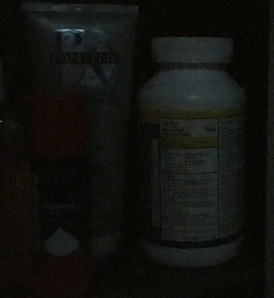
After the drug was consumed, I returned to our medicine cabinet to place the bottle on its shelf. Being of orderly mind, I attempted to turn the bottle where others could quickly determine its contents.
Not an easy task. In the dark, the front of the bottle looked like the back.
A simple design choice could have solved this problem. If the designer had made “Ibuprofen” in large type with strong contrast, users could speedily identify the contents in low light or daylight.
That points to the idea, dear readers, that whatever communications piece we are creating, whether a simple email or a lengthy novel, we need to focus on our main point.
Totally agree that we need to focus in all our designs. But I also notice that the issue of reading clearly in low light has become more of an issue the older I get. I remember being in design classes as a young woman and doing trendy layouts with small, light fonts and cool graphics, not being the least bit concerned about readability because my classmates all loved the look. Even years later, post-WBT, a young man at an agency I worked with designed a new website for the agency with the tiniest font! Fortunately the powers that be refused to approve it. We have to remember that, while we want our projects to be beautiful, contemporary, even artsy, our first responsibility is to communicate the message. And if we fail to do that properly, our gorgeous, trendy, artistic piece is a failure.
Completely agreed, Deb. It’s all too easy for inexperienced designers to put form ahead of function.