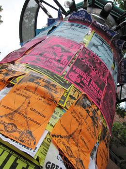
 This tower of public notices stands in downtown Boulder, Colorado – the home of a university with more than 30,000 students. Most of the posters are for live music events.
Did you notice that all of them look more or less the same?
How hard would it be to design a poster with catchy full-color photo surrounded by a significantly large white border ? Or maybe a 98% black poster with just a tiny bit of white type in the center? Then just put one on top of about every fifth standard poster. Those would stand out.
Takeaway: Let’s think outside the box, my friends.

I imagine production costs for photocopies or simple black offset printing are lower than using colored ink. But fewer posters in a more eye-catching (more expsensive) design might be just as effective.
I was in Eugene a few years ago and they have poles like this all over campus. To clean them off they take a torch to it, standing by with three guys with fire extinguishers.
That’s one way to deal with ’em!