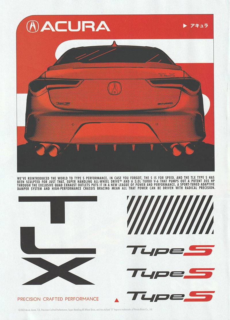
Acura spent a lot of money on a print ad for their new TLX. And it was very poorly done.
The basic design is OK, but the details are super sloppy.
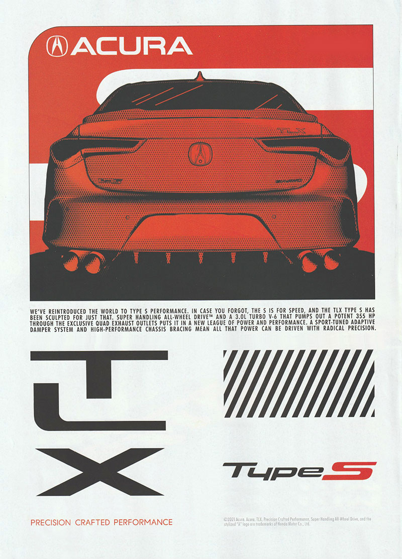
I was compelled to dissect the ad and reassemble it. If you look closely, you will see the differences. The original ad is at the top, and the fixed version is at the end of this post.
- The worst design element is the poorly spaced TLX logo. There’s a typographic principle of visual spacing vs. linear spacing. The original ad has the same distance between the bottom line of each letter. I moved the letters where they are in good visual relationship to each other, instead.
- Repeating “Type S” three times did nothing but make the page full to the brim with visual elements. White space is a design principle that when used correctly lets each element “breathe.” An analogy is sand on a beach vs. a grain of sand on a black countertop… you’ll never see an individual grain of sand on a beach.
- The little arrow with Japanese characters? Meaningless. They add nothing.
- The little arrow at the bottom of the page? Meaningless. It adds nothing.
- The fine print at the bottom on the original makes the page unbalanced. I moved it over to the right to balance out “precision crafted performance.”
I wish the ad had been precision crafted.

(By the way, sloppy IS OK when it’s it’s on purpose, like riding your mountain bike through the mud.)

