
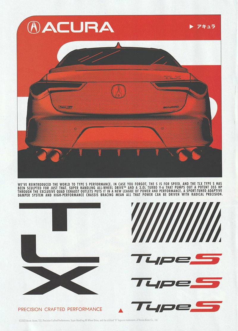
Acura spent a lot of money on a print ad for their new TLX. And it was very poorly done.
The basic design is OK, but the details are super sloppy.
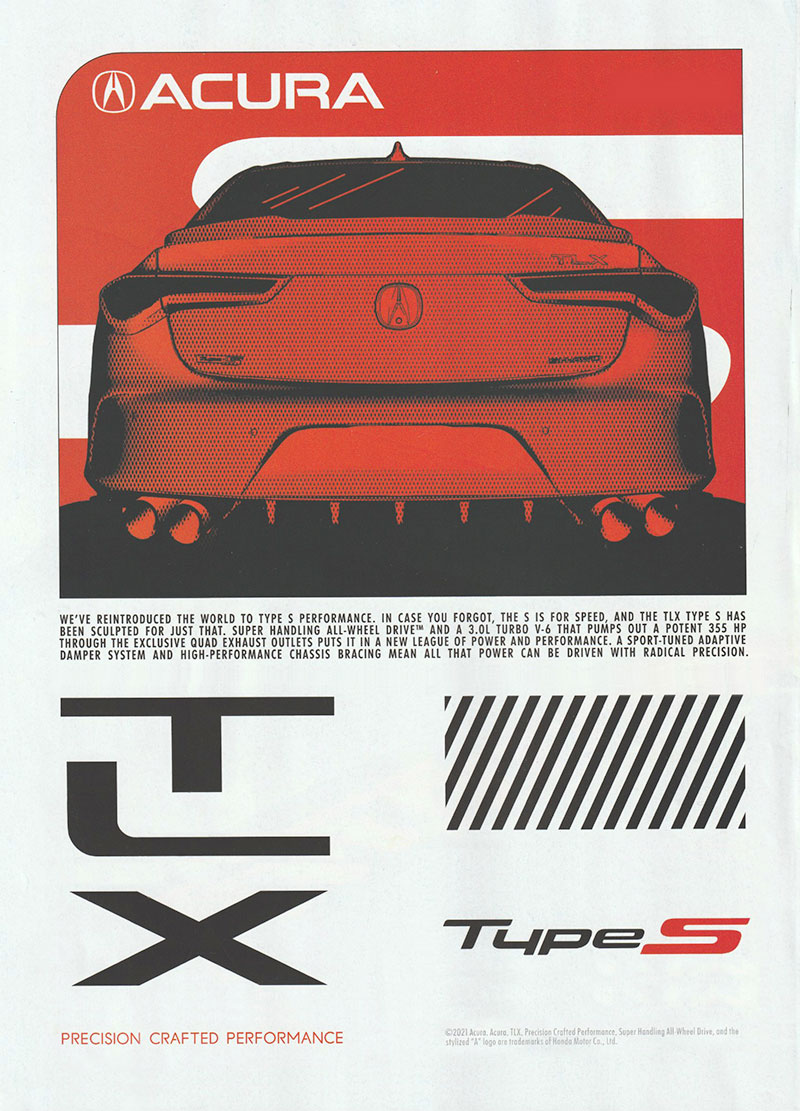
I was compelled to dissect the ad and reassemble it. If you look closely, you will see the differences. The original ad is at the top, and the fixed version is at the end of this post.
- The worst design element is the poorly spaced TLX logo. There’s a typographic principle of visual spacing vs. linear spacing. The original ad has the same distance between the bottom line of each letter. I moved the letters where they are in good visual relationship to each other, instead.
- Repeating “Type S” three times did nothing but make the page full to the brim with visual elements. White space is a design principle that when used correctly lets each element “breathe.” An analogy is sand on a beach vs. a grain of sand on a black countertop… you’ll never see an individual grain of sand on a beach.
- The little arrow with Japanese characters? Meaningless. They add nothing.
- The little arrow at the bottom of the page? Meaningless. It adds nothing.
- The fine print at the bottom on the original makes the page unbalanced. I moved it over to the right to balance out “precision crafted performance.”
I wish the ad had been precision crafted.
(By the way, sloppy IS OK when it’s it’s on purpose, like riding your mountain bike through the mud.)
I’d agree with most of your changes, except that I like the little arrow with Chinese characters at the top, although I can’t say why! I do feel like the “Type S” is a little floaty – possibly align it with the baseline of the X, or the top of the X? Not sure…
What is the point of the rectangle of diagonal lines? Is that a placeholder for a QR code, or just a graphic spacer?
It’s been more than 20 years since I was in design school, but even back then I noticed the classes moving away from details like typography, spacing, general clean-ness of design. How the design made you feel was more important. That was a time when, was it David Carson? was doing magazine layouts that were completely unreadable but looked really cool. In my mind, we are in the communication business and if the design looks cool but doesn’t communicate the message then it’s a failure
One other comment: The text box immediately under the red photo has the kerning between words rather than within words. That might be simply a style issue, but I’d like to see fewer white “rivers’ and better text spacing.
Thanks for your comments, Deb. I agree! And I appreciate your professional opinion as a graphic designer.
David Carson was way out there, design-wise, but he had more of his act together than the designer of this Acura ad. At least Mr. Carson’s work tilted toward modern fine art. He certainly did lose the idea of communication (which is the heart of good graphic design).
Very cool, dad. I love the attention to detail you have. I reached out to an ad campaign for Acura, and the Acura design reps and let them know about this. Would be fun to get a response!
Thanks, Jay!
Interestingly, since I published this, Acura came out with a better ad in the same series for their NSX.