Font problems

Apple Font Book screenshot

Those of you who have met me know that the first half of my career involved graphic design.

The tool of choice for graphic designers remains a Mac computer.

I recently made a life change that means my main daily tool is once again my beloved Mac. (Yay!)

As a designer, fonts are important.

One of the pain points of most of the applications on my Mac is the list of long fonts. For some of them, to choose an appropriate font means scrolling through a long list.

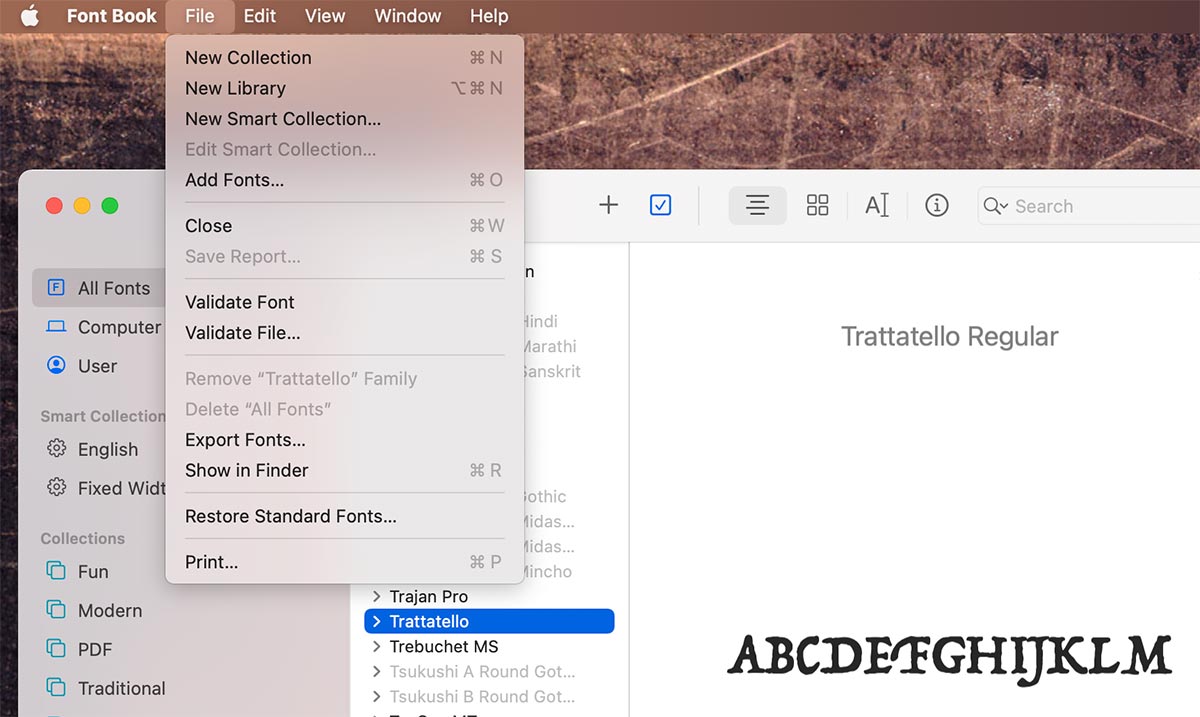
Font Book is a built-in Apple app that lets users manage their fonts. It allows you to disable some of the fonts. Then they won’t appear in your font list. But many global fonts and useless obscure-styled fonts are not removable.

Life is never perfect.

FacebooktwitterpinterestlinkedinmailFacebooktwitterpinterestlinkedinmail

Sloppy is not OK

Snippet from an Acura TLX ad
Acura TLX ad: original version

Acura spent a lot of money on a print ad for their new TLX. And it was very poorly done.

The basic design is OK, but the details are super sloppy.

I was compelled to dissect the ad and reassemble it. If you look closely, you will see the differences. The original ad is at the top, and the fixed version is at the end of this post.

  1. The worst design element is the poorly spaced TLX logo. There’s a typographic principle of visual spacing vs. linear spacing. The original ad has the same distance between the bottom line of each letter. I moved the letters where they are in good visual relationship to each other, instead.
  2. Repeating “Type S” three times did nothing but make the page full to the brim with visual elements. White space is a design principle that when used correctly lets each element “breathe.” An analogy is sand on a beach vs. a grain of sand on a black countertop… you’ll never see an individual grain of sand on a beach.
  3. The little arrow with Japanese characters? Meaningless. They add nothing.
  4. The little arrow at the bottom of the page? Meaningless. It adds nothing.
  5. The fine print at the bottom on the original makes the page unbalanced. I moved it over to the right to balance out “precision crafted performance.”

I wish the ad had been precision crafted.


Acura TLX ad: fixed version

(By the way, sloppy IS OK when it’s it’s on purpose, like riding your mountain bike through the mud.)

FacebooktwitterpinterestlinkedinmailFacebooktwitterpinterestlinkedinmail

Those coveted sneakers

When I was six years old, Red Ball Jets came out with the coolest sneakers ever. They were totally black except for the little red ball on the heel label.

I wanted some so bad that even though the store didn’t have my size, I was willing to get a pair that was way too big – just so that I could be cool.

That sense of cool was internal. I don’t remember any of my friends having a pair.

Many years later, I finally got my all-black sneakers.

This pair is even cooler. They are made from almost 100% recycled materials. It’s surprising how much they look like my childhood favorite shoes.


Rewards (sometimes) come to those who wait.

FacebooktwitterpinterestlinkedinmailFacebooktwitterpinterestlinkedinmail

BMW Stumbles

2021 BMW M4: before and after design suggestions

BMW decided to change the face of their vehicles. They went from subtle double-kidney grilles to massive gaping mouths. In their attempt to go for a menacing look, they went too far and landed on a face that not even a mother (or father) would love.

Car and Driver magazine agrees: “Do whatever it takes to ignore the new BMW M4’s toothy grille…”

Sometimes designers go too far on purpose to push the envelope. Over time, what was outrageous becomes acceptable.

I have to eat my words on Kia’s design decisions (see this post). Two years ago, when their Telluride large SUV came out, I thought it was quite ugly. Now I’m used to the look.

I’m not sure if I will ever get used to BMW’s new face.

So I did a little work in Photoshop on James Lipman’s photo and made the grille more the size that God intended. (See above.)


Let’s push the envelope, but not too far.

FacebooktwitterpinterestlinkedinmailFacebooktwitterpinterestlinkedinmail

Kia woke

the faces of Kia vehicles

Kia woke up and came back to the mainstream.


Kia’s design department went through a recent rough patch, during which they headed in a rather oblique direction with the look of the front of their vehicles.

The 2017 Kia Sportage typifies their ugly period. (Let’s just be honest.) You’ll see that in the left side of the photo montage above. Think of a carp’s face.

They finally decided to come back to the rest of the automotive universe. The right side of the photo montage is the 2021 Kia Sorrento.

The face is the most important part of any car design. We can relate to a car’s mouth (grille) and its eyes (headlights).

For the 2021 Sorrento, they decided to go in a more snarling mean-looking direction. It works. SUVs are supposed to be rugged.


The left photo is courtesy of Car & Driver. The right photo is courtesy of Kia. Both are not used with permission.

FacebooktwitterpinterestlinkedinmailFacebooktwitterpinterestlinkedinmail

The incomprehensiveness of fashion

prada sneakers

Prada has a new pair of shoes – the Cloudbust Thunder.

They look like kids’ Power Rangers shoes. They appeal to… I’m not sure who.

And they are priced at $895, before taxes.

Why?

I’m sure they cost more to make than the Nikes people buy at Walmart. Prada designers are more highly-paid. Their nylon threads are sustainably-sourced. (Maybe not on that last one.)

It’s a luxury product from a luxury manufacturer. The outsized lug soles will not provide greater traction as the wearer navigates moonscapes. But the style will stand out in any crowd – at least to the shoegazers.

Interestingly, these shoes are in Prada’s “Must Haves” category.

Not for this shoegazer.

FacebooktwitterpinterestlinkedinmailFacebooktwitterpinterestlinkedinmail

Design for humans.

skin creme container protective cover

Product designers forget their end users.

This tube of creme had a security seal that would only come off using a pair of vice grips. The manufacturer never tested that seal with human hands.

Poor design surrounds us.

Bathroom hand dryers… the popular Xlerator makes so much noise that hearing damage may result. Dyson’s Airblade dB pushes your hands toward the sides – thus negating some of the hygienic effects of touchless air drying.

And the list goes on.

FacebooktwitterpinterestlinkedinmailFacebooktwitterpinterestlinkedinmail

Drawn to texture

a sea of toys at a charity shop

I love patterns.

Tha artistic side of my brain loves how zooming out on a sea of similar things creates a montage of uniformity with vast contrasts.

If you’ve looked at the masthead of this website, you’ll see a set of patterns that I found interesting. (Click on “Shiny Bits of Life” at the top. Then hit the refresh button on your web browser to see them all.)

Life is a montage of experiences and memories. They pile up and build a texture of thoughts and actions that make up who we are.


Footnote: I took this photo at a local charity shop. Sadly, these toys will mostly eventually end up in a landfill.

FacebooktwitterpinterestlinkedinmailFacebooktwitterpinterestlinkedinmail