Different interpretations

three book cover designs for Nineteen Eighty-Four

I love going to bookstores. Since much of my professional life has been spent doing graphic design, I love seeing how other graphic designers interpret the themes of books.

Lately, Nineteen Eighty-Four has been a popular book in the United States. The current political situation has caused some to think of the world depicted in that novel. (You’ll get no commentary on me about that, at least at this point. I’m really burned out on politics.)

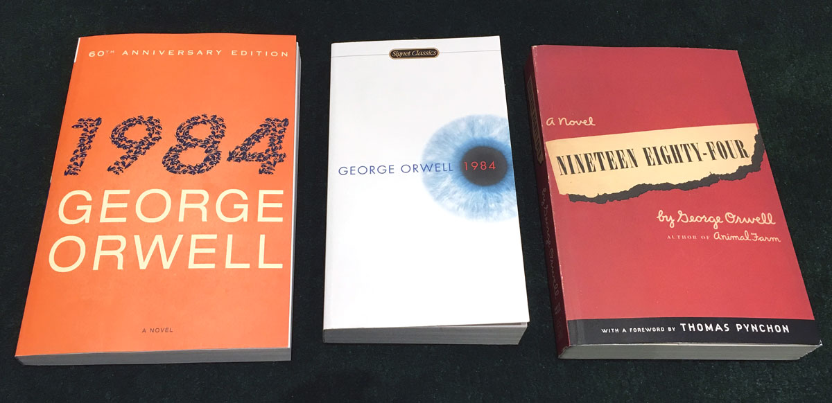
I enjoyed finding three different paperback versions of the novel on the bookshelves of The Tattered Cover. Each one is very dissimilar. And they have three varying price tags: $9.99, $16 and $17.I did not take the time to discover the creators’ names, but I’d guess that there are three different artists.

I did not take the time to discover the creators’ names, but I’d guess that there are three different artists.

My favorite is the mostly white cover, which seems the most modern. (And again, I didn’t research the publication dates.)

It’s fascinating to me how different people interpret the same thing in such varied ways. I’d guess that there must be at least 100 different covers for that famous novel, that was published in 1949.

FacebooktwitterpinterestlinkedinmailFacebooktwitterpinterestlinkedinmail

You can’t force it

Lincoln Continental print ad

Lincoln bought the emperor’s new clothes.

This ad appeared in the February 2017 Fast Company magazine (in a very high-priced spot – the inside front cover). Lincoln paid a massive amount of money for the ad series, shot by renowned photographer Annie Leibovitz.

Agency Hudson Rouge made out like a bandit.

But Lincoln did not think about their real audience. Showing a 20-something person behind the wheel of a $60,000-ish luxury car, newly-minted from a marque typically bought by people above 60, will not make 20-something people want to buy one. Nor will it make 60-year olds who want to be 20-something want to buy one.

No matter how much the critics like the car.

Yes, it would have been appropriate for Lincoln to push the envelope in their marketing – but not so far.

Maybe they should have put kids under 10 behind the wheel – that audience will need to buy cars, eventually.

FacebooktwitterpinterestlinkedinmailFacebooktwitterpinterestlinkedinmail

Come on, invent that

window-gap

New windows for an old building… sometimes that doesn’t work.

Seeing this gap reminded me of reading a great phrase someone really smart once said: “no one puts new wine into old wineskins.”

And that made me think of the gaps that are all over Colorado’s roads. The extreme heat and cold we experience – and the water that seeps underneath our road beds – cause all manner of cracks and holes to appear – and gradually become larger and larger.

Road repair budgets are not what they used to be, so car repair bills related to tires and wheels are becoming commonplace.

Why can’t a smart engineer-type invent an inexpensive elastic road surface that will expand and contract with the changes in weather and precipitation? This surface would need to provide a uniform surface – as in, very smooth.

Know anyone up for the challenge?

FacebooktwitterpinterestlinkedinmailFacebooktwitterpinterestlinkedinmail

Even though we know it

Starbucks Mug

When I finished college, I hung out with a group of designers in Dallas, Texas. One of the things we enjoyed was sharing meals together at some of the town’s many many dining establishments. And we would always critique each restaurant’s menu design.

Even though we were (and some of that group still are) involved in designing things like menus – or product packages – we were and are still susceptible to the lure of a well-designed piece.

It makes logical sense that knowing we’re paying for the ambiance of a particular restaurant with basically the same food as a cheaper but more spartan restaurant a few miles away might make us head for the cheaper place – but no. Or we’ll buy a thing with a fancy box instead of the same thing in plain box.

(The budget factor does play into our decisions, of course!)

Experience includes all of our senses. We pay for experience.

Photo: I love many of the designs Starbucks creates, including this mug. And they do a pretty good job with the customer experience, as well.

FacebooktwitterpinterestlinkedinmailFacebooktwitterpinterestlinkedinmail

A single focus

a medicine bottle in the darkMy molar was still aching, even though the dentist with a thick accent completed the filling a week ago. So it was time for ibuprofen.

After the drug was consumed, I returned to our medicine cabinet to place the bottle on its shelf. Being of orderly mind, I attempted to turn the bottle where others could quickly determine its contents.

Not an easy task. In the dark, the front of the bottle looked like the back.

A simple design choice could have solved this problem. If the designer had made “Ibuprofen” in large type with strong contrast, users could speedily identify the contents in low light or daylight.

That points to the idea, dear readers, that whatever communications piece we are creating, whether a simple email or a lengthy novel, we need to focus on our main point.

FacebooktwitterpinterestlinkedinmailFacebooktwitterpinterestlinkedinmail

You get what you pay for – sometimes

mercedes-benz maybach s600 speedometermercedes-benz maybach s600 list price
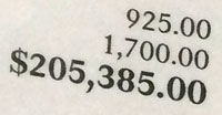
A few weeks back, I visited a Mercedes-Benz showroom and sat in a $205,385 Maybach S600 sedan. As you might guess, the quality was so amazing I could almost taste it.

Except for the video-monitor style gauges. Mercedes did not get the message that a $299 list-price iPad Mini has a much better display.

The devil is in the details? Maybe in this case!

FacebooktwitterpinterestlinkedinmailFacebooktwitterpinterestlinkedinmail

It is OK to just look

Sole of Converse sneaker with clear rubberNordstrom Rack is a great place to get quality clothes for sometimes way less than list price.

Even better than buying stuff from there is to just enjoy it – at least in the case of shoes. I love shoes but don’t need any. So as we were shopping for some dreadfully-needed running shoes for Rachel (our daughter), I enjoyed just looking at other shoes.

I loved this particular Converse model – clear rubber with the logo embedded underneath. Way cool.

And even better than just looking was capturing it digitally – for my grandkids someday.

FacebooktwitterpinterestlinkedinmailFacebooktwitterpinterestlinkedinmail

Change is not always better

mac interface screenshot, showing new typefaceI very much love Apple products. One of the thorns in my side is spending my 8-to-5 on a Windows 7-based laptop. It works fine, but I very much miss using a Mac. (And changing back to a Mac at home messes with my head.)

Like every forward-facing company, Apple is always changing things. The latest computer operating system, Yosemite, has some significant improvements. But the new system-wide typeface is harder for my non-assisted eyes to read. The Helvetica-like “6” looks too much like an “8.”

If we could pick and choose what gets changed in our lives, that would make us God. But we can’t, so I’m hoping the not-fun-changes will make us stronger.

Footnotes:

  1. There are some ways Windows is better. One good aspect is having both a delete key and a backspace key.
  2. If you have a minute, in the comments, share a change you experienced that provided both good and bad results.
  3. My Mac starts up much faster with Yosemite. (Your results may vary.)
FacebooktwitterpinterestlinkedinmailFacebooktwitterpinterestlinkedinmail

Inspiration can be anywhere

interesting headline treatment
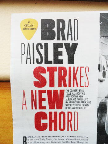
Parade magazine is not where I usually look for visual inspiration. However, this article’s headline was visually very interesting! (Also, note the creative treatment of the writer’s byline.)
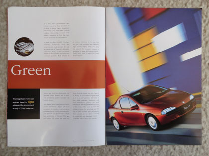
Some takeaways:

1. Look all over to get inspiration.

2. Don’t consider any source of ideas to be unworthy of your attention.

FacebooktwitterpinterestlinkedinmailFacebooktwitterpinterestlinkedinmail

Look the other way

1995 Vauxhall Tigra car spreadCreativity is elusive sometimes. When you reach the bottom of your cup, it can be hard to find inspiration.

One new direction is to think the opposite of the way you would normally think. The designers of this brochure, circa 1995, used a red car and primary headline bar to illustrate Green – the complete opposite.

And it worked. If the designers had used a green car and a green headline bar, the result would be … boring.

FacebooktwitterpinterestlinkedinmailFacebooktwitterpinterestlinkedinmail