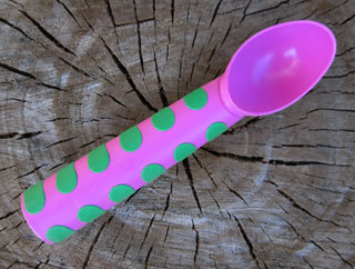
Not fit for scooping

ikea-scoop…But it is fit for being a toy!

Johanna’s daughter Elsie is now playing happily with this scoop, even as I write this. It’s just too light for using to scoop ice cream properly, but it makes a wonderful bright shiny bit of life for her.

Why did I buy it in the first place? It was only 99c at Ikea. I was a sucker for the design (and still am). But you know my philosophy of not keeping things I don’t need. So what a great thing to give it a new life!
FacebooktwitterpinterestlinkedinmailFacebooktwitterpinterestlinkedinmail

Small (short) is better

mbp-design

Most of my readers know that I cling to the credo, “short is sweet.” This relates to “less is more” concept.

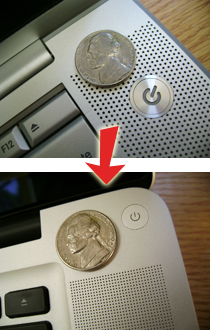
Most of the time, computers get better. Apple updated their MacBook Pro line in October 2008. This was their first significant visual redesign since the first PowerBook G4, which came out in January 2001! And it was better in almost every way. They made some of the design elements smaller. You can see the power button and speaker holes shrunk by large percentages. I think it was a positive move.

Takeaway: When you write for your blog, magazine, newspaper, or whatever – see how few words you can use to make your point. Your readers will silently thank you.

FacebooktwitterpinterestlinkedinmailFacebooktwitterpinterestlinkedinmail

Design is where you find it

kid-gym

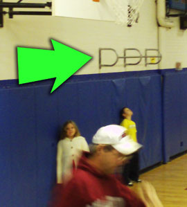
Not long ago, I went to a band concert at Ben’s middle school. Like most middles schools here, the gymnasium is also the concert hall. So I looked at the wall, and “The Three D’s” logo was there. (What’s “The Three D’s? I don’t know, but if they contact me, I can hook them up with their logo.)

FacebooktwitterpinterestlinkedinmailFacebooktwitterpinterestlinkedinmail

Bad juxtapositions

university of denver

The architect meant well. He was seeking to combine classical elements with a modern twist. I would suggest that he failed. The gold-and-maroon dome does not sync well with the rest of the building. And where in classic architecture do you see a 360-degree clear glass balcony?

It is very possible to combine classic design with modern style – but that is a difficult task. All the more pity when millions of dollars have been spent in the exercise.

The beauty of graphic design is that the stakes are usually much lower. One exception would be when a corporation rolls out a new logo. If they failed, it’s hard to roll back in the red carpet.

FacebooktwitterpinterestlinkedinmailFacebooktwitterpinterestlinkedinmail