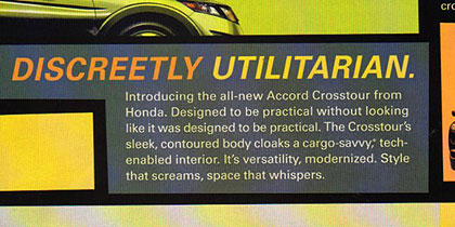
 This appeared in the American edition of the new Honda Crosstour ads. (That’s a new car that is basically a bloated Honda station wagon. I like it on some levels and hate it on others. The same footprint could yield far more utility than the Crosstour delivers.)
Incidentally, the ads are really unappealing, design-wise. (My suggestion? Use regular color when visually describing a product.)
And by the way, there is a much cooler Honda in a similar vein that one can buy if they live in Japan: the Stream. It doesn’t have America’s unfortunate SUV aspect in its flavor mix.

OK, so I am a big fan of this blog post, because I am a copy writer (though more often a copy editor).
So I nearly jumped out of my chair this evening when I opened up the National Geographic issue of this month and saw a nearly identical ad just opposite the cover page.
And the copy changed! Now it reads: “Introducing the all-new Accord Crosstour from Honda. Don’t let its sleek, aerodynamic exterior fool you. Inside there’s a world of smart, cargo-friendly design. It’s the perfect combination of style, amenities and space. So you can have your cake, and bring it too.”
A vast improvement! But I’m a little shaky on the very last phrase.
I will note, too, that the colors changed to blues and greens.
Very good eagle-eye detective work, Johanna!
It’s nice to see when companies actually improve their communications efforts – or when they are paying attention and are willing to change.