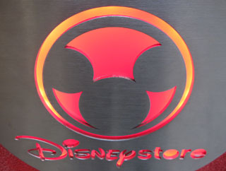
 When I saw this logo, the first thing I thought of was “biohazard”. I don’t have any negative feelings towards Disney Stores, but their logo looked a lot like the biohazard symbol.
Yes, I know there is the figure-ground thing happening (for those of you who might have taken an art class). But the red toxic waste aspect to the symbol also conspired against my perceptions.
It boils down to usability. They designers (or the client) should have tested this application of the logo with a few more people before it saw the light of day. A simple change to light green would have done the trick.

Huh! I thought it was some superhero logo until I looked again. I haven’t looked at Mickey in some time, but I didn’t think his ears were almost as big as his head, and as round.