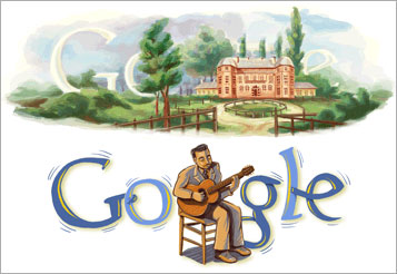
 Google runs the world. Well, not quite. But they obviously have a massive impact in the sphere of internet use.
Though their applications are very minimal in design, they use some creativity in the presentation of their logo on their landing page. But there is a spectrum of legibility and creativity – when does the creativity go to far? (The top commemorates the birthday of Napoleon Orda of Belarus. The bottom commemorates the 100th Anniversary of Django Reinhard’s Birthday.)
By the way, this post was inspired by my brother Bill. He doesn’t blog, but he is very active as an Amazon reviewer. And Google, of course, provided the logos. Thanks both.

“But there is a spectrum of legibility and creativity”–good point for graphic designers and copyeditors alike. Thanks Paul.
It seems to me that awhile back, Google played with their logo on rare occasions. Now it happens all the time. I liked it better before. Every time I see a new play on their logo, I feel like they’re taunting, “Yeah, we’re cool, and we know it.”
Dunno. I personally like understatement.