 Creativity is elusive sometimes. When you reach the bottom of your cup, it can be hard to find inspiration.
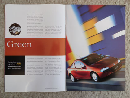
One new direction is to think the opposite of the way you would normally think. The designers of this brochure, circa 1995, used a red car and primary headline bar to illustrate Green – the complete opposite.
And it worked. If the designers had used a green car and a green headline bar, the result would be … boring.
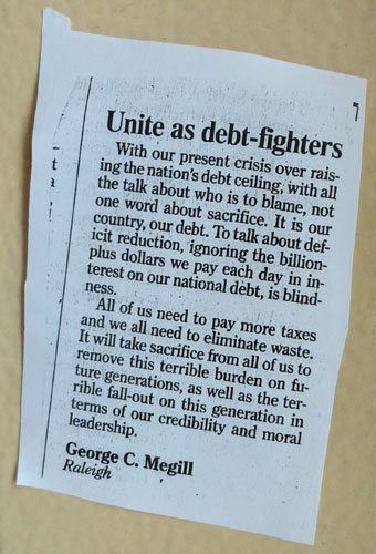 My uncle snail-mailed me this letter to the editor he recently wrote. He was thrilled to see his name in print. I have wondered what makes some of us enjoy that recognition. Here are a few ideas why:
 Our culture tends to have knee-jerk reactions. As eBooks have been on the rise, many people say the printed book will die. It is very true that paper mills are closing and that physical book sales are way down. But I predict that the printed page will continue for many years.
 I found this card on the parking lot of a Target store.
 Last fall we went to Aspen for a weekend getaway. (We did not take a private jet – just our minivan.)
 If you’ve never been to a
  I love IKEA. But they did not get their trash cans right. What are blue recyclables and what are green recyclables?
 Bicycles are all over Oxford, England. (Good thing, since there are few places to park a car!) Signs are on every surface that isn’t moving. (And some that are.)
 I am amused by spam.
 “Wonky” is a great word. Askew or amiss might have a close meaning, for those of you not from the UK.