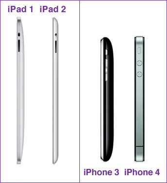
 I’ve always thought it was strange that Apple went in opposite directions for their iPad and iPhone lines.
Version 1 of the iPad has rectangular edges. Version 2 has a clamshell design.
The iPhone? Version 3 has a clamshell design. Version 4 has rectangular edges.
Apple is going divergent directions with these two product lines.
Preference for me? I like the clamshell.

I do not own an iPad, but I like the clam-shell design as well. But I absolutely hated the arched back on the iPhone 3. It never seamed like it was sitting level, unless you put a bulky case on it. The flat iPhone 4 can lie (and not slide off) most surfaces, even without a case.
– JT
having had iPhone 3 and 4, 3, did sit in your had nicer, but 4 doesn’t’ slide of your knee when listening to music. If interested, the functionality of 4 completely obliterates that of the 3, 3g or 3gs!