 My molar was still aching, even though the dentist with a thick accent completed the filling a week ago. So it was time for ibuprofen.
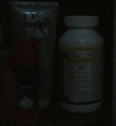
After the drug was consumed, I returned to our medicine cabinet to place the bottle on its shelf. Being of orderly mind, I attempted to turn the bottle where others could quickly determine its contents.
Not an easy task. In the dark, the front of the bottle looked like the back.
A simple design choice could have solved this problem. If the designer had made “Ibuprofen” in large type with strong contrast, users could speedily identify the contents in low light or daylight.
That points to the idea, dear readers, that whatever communications piece we are creating, whether a simple email or a lengthy novel, we need to focus on our main point.
 I bought this knife when I was about 12 years old. I still have it. As you might guess, it’s a little too bulky to carry around in my pocket. But I do throw it in the luggage when we’re heading for an overnight.
 I went to Target a few Saturdays ago and was amazed to see a black
  While we were visiting my sister and her family in Belgium, we went to the
  Yes, you’ve heard me say this concept before, many times. But I think it’s vital to add excitement to whatever you are doing.
 Trust me, this is the coolest Windows laptop ever.
 This falls under the category of bad art direction… Notice where the hands are on this computer. If the model’s arms were at the angle shown, an amputation would have taken place before the shot.
 Nissan recently came out with a two-door convertible SUV – the
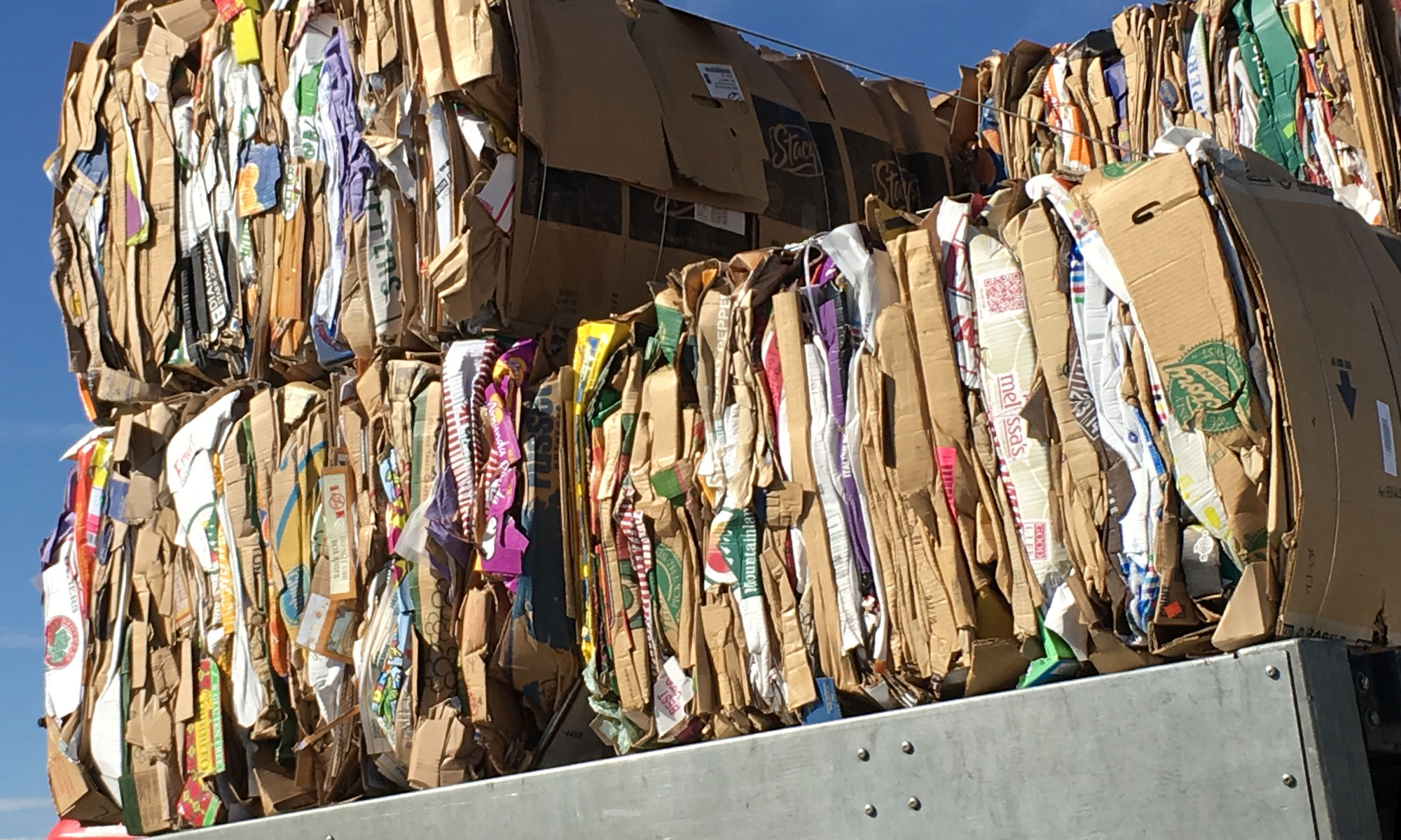
 I saw these and had to take a photo to share with you.