Simple solution

We got this vacuum cleaner about a year ago. My mom died and we inherited it.

Anyhow, I like the bag-less aspect. Heather doesn’t.

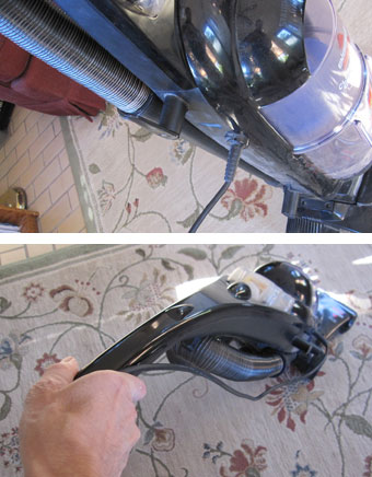
But the one thing that they did wrong is the power cord. It comes out of the side! A very simple way to make cleaning rugs with it easier: have the cord come out of the top of the handle! As it is, I have to hold the cord with the other hand to keep it from running under the brushes.

(And yes, I miss my mom. I wish she were using it and not us.)

FacebooktwitterpinterestlinkedinmailFacebooktwitterpinterestlinkedinmail

They listened to me

We did a family grocery shopping trip the other day. I was thrilled to see the top of a Nature’s Path granola box.

In January, I blogged about how Kashi, a “natural” cereal manufacturer, had gotten things wrong by making their boxes much larger than the cereal inside required.

Nature’s Path read my post (not really – they probably figured it out on their own) and made their boxes in just right sizes to fit the cereal inside! Yay!!

(And yes, I voted with my wallet – I bought two boxes. Being on sale was a special bonus!)

FacebooktwitterpinterestlinkedinmailFacebooktwitterpinterestlinkedinmail

They don’t make them like this anymore

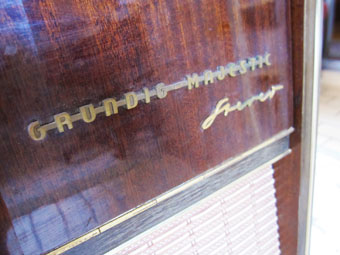
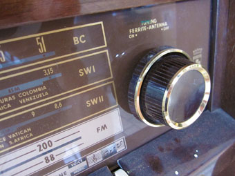
grundig1grundig2Curbside.

I saw this beauty, waiting for the dumptruck to haul it away. I nearly cried at the thought of it entering a landfill.

Grundig Majestic. Made in Germany in maybe 1960. Beautiful rosewood veneer. Shortwave radio, along with a turntable. (Of course it doesn’t work.) If we had room, I’d gut the interior and make it into a cabinet of some sort.

Alas, the house is full, so I sold it on Craigslist. The gentleman who bought it wants to use the shortwave. Triumph!

FacebooktwitterpinterestlinkedinmailFacebooktwitterpinterestlinkedinmail

Fun shoes

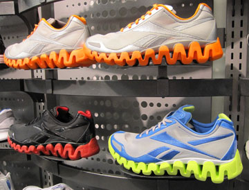
weird-shoesReebok recently released the Zigtech shoe line. I think they’re really fun. Heather doesn’t like them. I don’t need a new pair of shoes, so the decision to not buy a pair was easy.

Which one do you like best? Or are you with Heather on this one?

FacebooktwitterpinterestlinkedinmailFacebooktwitterpinterestlinkedinmail

Cool backpack

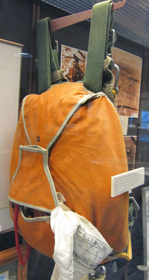
cool-backpackThis baby was from World War II, Japan.

I do have this theory that Japan has more cool stuff than just about anywhere else in the world, except maybe Italy. This backpack is actually a parachute – from the Fort Wayne Air Museum.

Cool.

FacebooktwitterpinterestlinkedinmailFacebooktwitterpinterestlinkedinmail

Car design trends, part 2

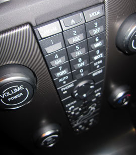
form-v-functionThis “center stack” of dashboard controls looks pretty cool. It’s from a Volvo. (I can tell by the typeface.)
Design mistake? When you’re driving down the road at 75 miles an hour (120 kph), the last thing you want to do is take your eyes off the road long enough to figure out which button you need to push to make the hot air go to your feet rather than at your face.

Takeaway? When you’re designing that thing – or planning that speech – go for what will serve the user best rather than what causes the biggest wow. (But be sure to leave enough wow in to make it exciting!)

FacebooktwitterpinterestlinkedinmailFacebooktwitterpinterestlinkedinmail

Car design trends

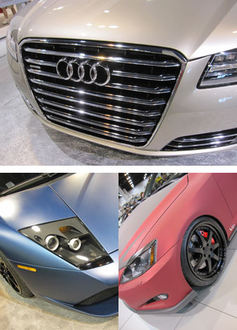
car-design-trendsTop: The forth-coming Audi A8. Notice the resemblance to the front of a train. That design trend started in Europe because their pedestrian safety laws forced vehicle fronts to be more horizontal and less pointy.

Bottom: Matte-finish paint seemed to be popping up in a few places among the cars we saw at the Denver Auto Show. My son Jay and I both liked the visual effect. (Left is a Lamborghini and right is a Lexus.)

FacebooktwitterpinterestlinkedinmailFacebooktwitterpinterestlinkedinmail

Biohazard

biohazardWhen I saw this logo, the first thing I thought of was “biohazard”. I don’t have any negative feelings towards Disney Stores, but their logo looked a lot like the biohazard symbol.
Yes, I know there is the figure-ground thing happening (for those of you who might have taken an art class). But the red toxic waste aspect to the symbol also conspired against my perceptions.

It boils down to usability. They designers (or the client) should have tested this application of the logo with a few more people before it saw the light of day. A simple change to light green would have done the trick.

FacebooktwitterpinterestlinkedinmailFacebooktwitterpinterestlinkedinmail

Cool cars

crzjag-clockLast weekend, my son Jay, his friend Taylor and I went to the Denver Auto Show. It was great!

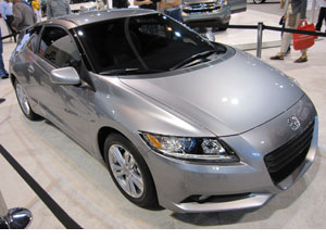
A highlight was seeing the Honda CR-Z in real life. It’s a small 2-seater that’s the grandchild of my favorite car that I ever owned, a Honda CRX. They both have a great combination of fun driving and excellent fuel economy. The CR-Z updates the formula by adding hybrid drive. (And of course the cost will be about four times what the CRX was, not adjusted for inflation.)

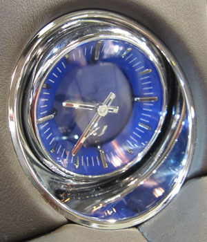
The lowlight was the new Jaguar XJ. For more than $72,000, it did not deliver anything close to my expectations. Admittedly, I did not get to drive one. But I sat inside and played with all the knobs and controls. I was completely unimpressed at how one of the rear passenger lighted mirrors did not come on like it was supposed to. And from this pic, you can tell that they stylist chose a clock that would have been more at home inside a 1980 Cadillac. It also looked like I could have bought one off a vendor in the streets of Nairobi for about $20.

My only regret about the show was that John could not join us. (He’s in Germany.)

FacebooktwitterpinterestlinkedinmailFacebooktwitterpinterestlinkedinmail